GalleryPal
Making art education fun and
accessible for users
Timeline: 5-Day Google Venture's Design Sprint
My role: Solo Student Project for Springboard UI/UX bootcamp
Challenge
GalleryPal has found that art museum tourists are not getting useful information in a convenient manner during their visits.
Tools used: Figma and FigJam
Solution
Broaden the information available to users and make it more fun to learn.
If you want to go fast, go alone.
If you want to go far, go together
Day 1 - Map
Foundational understanding of the art and the artist behind it can enhance the experience in a museum and gallery.
Understanding the user needs
Reviewing all the research, I found out that curiosity arises in when visitors are drawn to certain art pieces, the techniques artists use, or even the backstory of the art and the artist.
But here's the catch: too much information, such as long articles and books, can make users lose interest. This sets up an interesting challenge. We need to help visitors and app users learn without overwhelming them.
MAP & How Might We
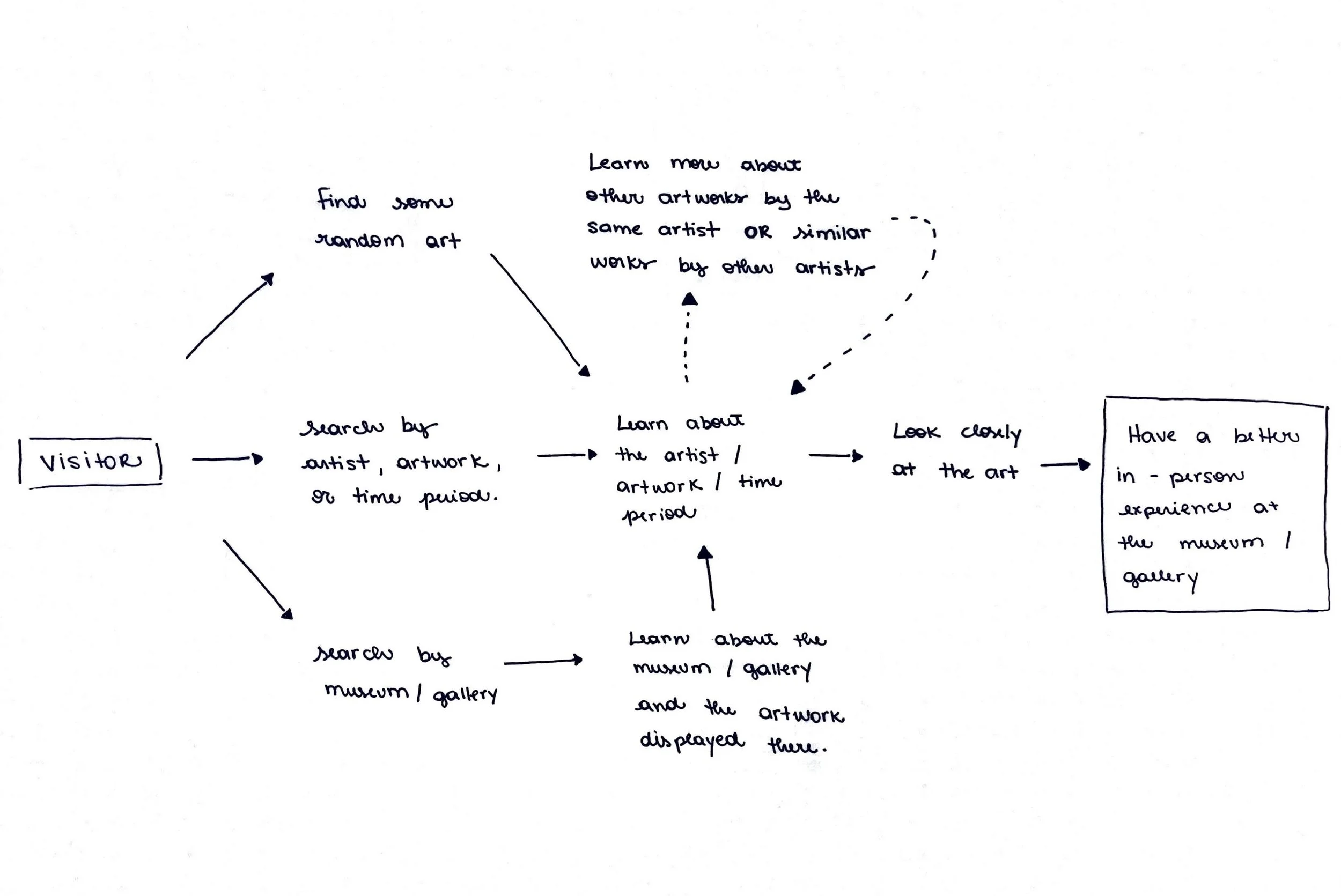
Having assimilated the pain points and factors that engage visitors in a museum, I developed a map to visualize and understand the flow of GalleryPal. Additionally, I formulated some HMW (How Might We) questions to guide my exploration and ideation process.
Things that I learned
Learning from Users
I felt limited working alone. My ideas were not as diverse as when I collaborate with others. I strongly believe that when we work with a team, the multitude of perspectives can be incredibly valuable, especially for a design sprint.
Through this project, I discovered my passion for teamwork and realized that collaborating with others leads to better results for users.
Testing is developing into my favorite part of the design process. I enjoy learning how people use what I've made and how they feel about it. Whether they like it or have suggestions, it helps me understand my users better.
Day 2 - Sketching
Lighting Demos
During this phase, I explored various apps not necessarily centered on museums but still offering value in similar user journeys. I examined applications relevant to finding information, whether it pertained to movies, books, or simply seeking answers to questions (Q&A).
Book Details and Story-like Insights
What caught my attention with these screens is the way they display the photo, with the name of the book followed by the writer's name.
Additionally, I appreciate that it provides insights in short texts, somewhat resembling stories, similar to Instagram.
Day 3 - Decide
Taking a step further! 🚀
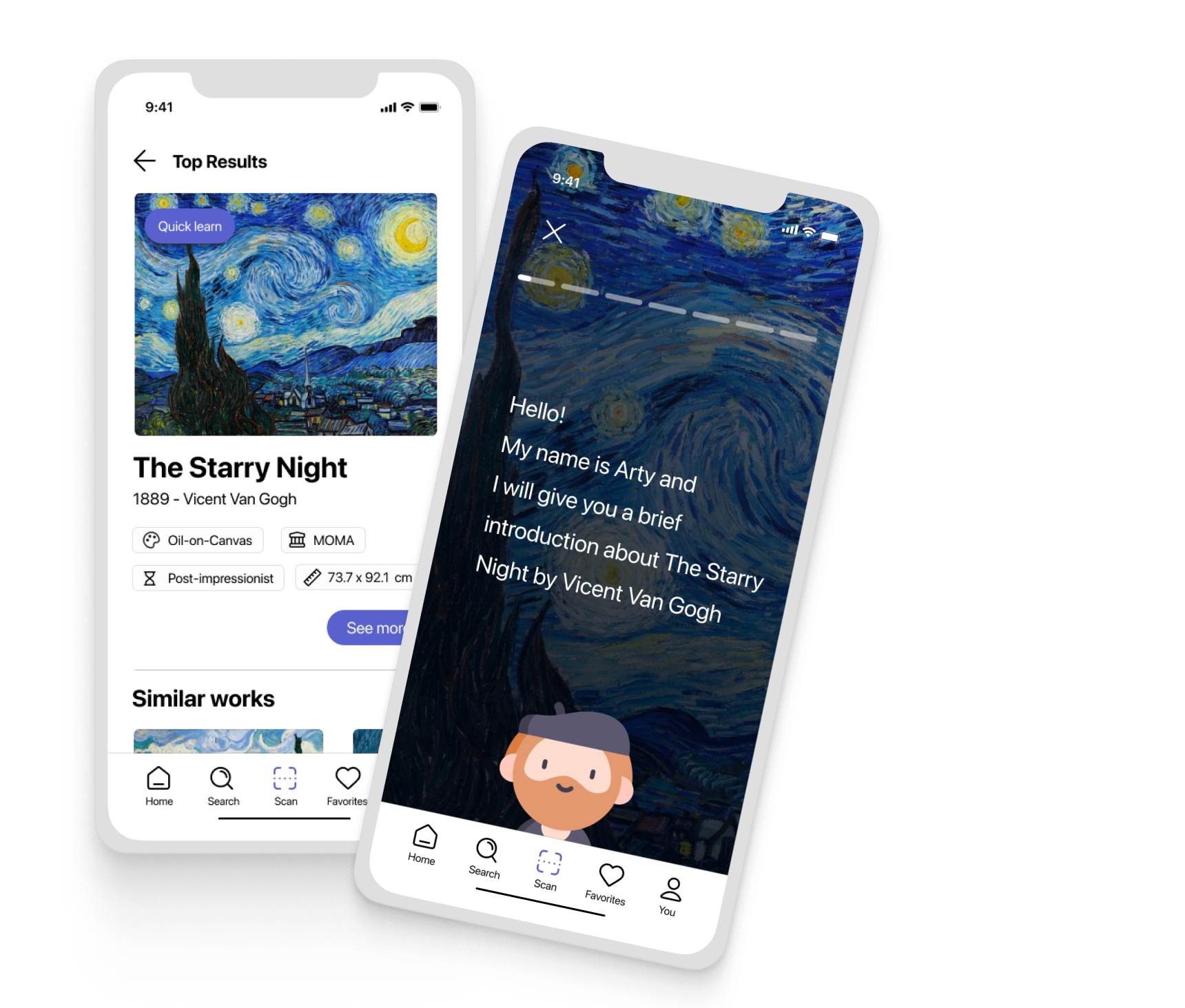
Initially, I was planning to work on sketches containing information about the art, allowing users to see what they want to learn. While this is still possible, I thought about taking it a step further and testing the idea of presenting the information in a story format—similar to Instagram or those shorts on YouTube.
I believe this format would be more appealing to the public, and my goal is to make it shorter. An example concept would be a feature that teaches you about the painting in 1 minute.
Additionally, something I plan to incorporate into the app is a cartoon or character. I think it would be fun for users to have a kind of mascot that guides them through the app—similar to Duolingo and our beloved Clippy*, the Microsoft 95 Paper Clip.
* If you remember Clippy, you're getting old my friend! And so am I!
Storyboard
Exploring Categories and Top Picks on Amazon Prime
On the first screen, I like how it provides users with categories to explore, and there's also a large section at the bottom that organizes shows/movies by genres.
On the second screen, it displays the top results as well as what other viewers also watched.
Crazy 8’s
Day 4 - Prototype
Don’t forget the main goal is the user!
During the prototype process, I kept in mind that it needs to be very fast, and I can't overlook the minute details (even though I wanted to). Besides inspirations from apps in the Lighting Demos (Day 2), I tried to find as many inspirations as possible regarding buttons, tab bars, and apps that I found interesting.
My main goal while I was prototyping was to keep the user in mind, their struggles, and what they would appreciate to see when using GalleryPal.
Day 5 - Test
The app's cleanliness and focus on essential information
proved successful among users
On the last day of Sprint, I conduct 5 usability test with people who were interested in or had a bachelor's degree in History, and like to visit museums.
Overall, the app received great feedback for being clean and providing only essential information.
Arty (the character) was really the highlight for everyone, and users appreciated the fact that it was in story mode. They could recognize exactly what to do and how it works.
Main improvements found on the testing
Efficient FAQ Display: Chime's User-friendly Approach
I like how Chime placed the Frequently Asked Questions in cards and the user is already able to see the answer below the question.
Sketching
During the sketching phase, first selected the most critical screen by identifying, on the map, the screen that best aligns with the goal of the design challenge.
The user's experience at the museum will be enhanced when they learn about the artist or artwork they are seeing. They may even discover something unexpectedly.
Therefore, the critical screen would be the learning screen that provides information about the art, artist, and museum.
Solution sketch
“I like that it is a very clean design, very simple. If I am in an art museum, I already get so many visuals, so when it is my phone, I don’t want to look at so many details.”
Interactive Prototype
Below, you can interact with the prototype.
Please note that you may notice some differences, as I updated the prototype after conducting the interviews.


